Thursday, 27 April 2017
Tuesday, 25 April 2017
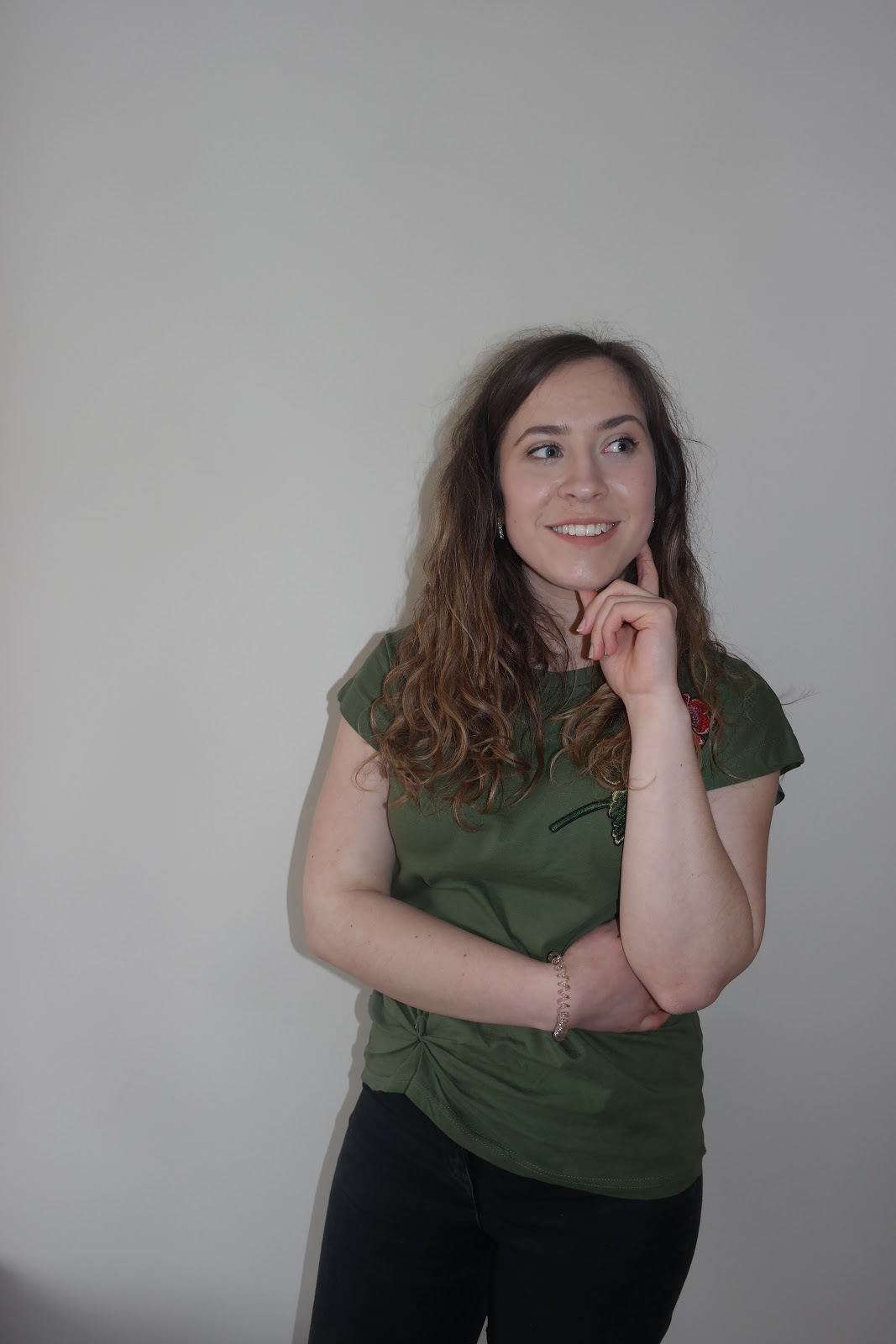
Target audience profile
I wanted to create this video to show exactly who my target audience is. I have been inspired by the style that Alessia Cara shows and I have tried to focus my target audience on the same target audience that she has.
Final Magazine Advertisement

Magazine Advertisement Draft 2

Magazine Advertisement Draft 1


Sunday, 23 April 2017
Final Digipak- The back page

Final Digipak- Inside Page

Final Digipak- Front Page

Friday, 21 April 2017
Digipak information
After thinking about what should be in my digipak, I have finalized the information inside.
- Singer's name; Abbie Rose
- Album Title; Ordinary Me
- Message Inside;
- Tracklist;
- Singer's name; Abbie Rose
- Album Title; Ordinary Me
- Message Inside;
THANK YOU SO MUCH FOR PURCHASING MY ALBUM AND FOR SUPPORTING ME AS AN ARTIST. YOU ALL MAKE ME FEEL BETTER IN MYSELF AND MY AIM IS TO GIVE THE SAME LOVE BACK. I WANT TO MAKE EVERYONE FEEL BEAUTIFUL AND REALISE THAT THEY ARE PERFECT IN EVERY WAY. NO ONE HAS FLAWS AND EVERYONE IS UNIQUE IN THEIR OWN SPECIAL WAY. MY DEBUT SINGLE 'SCARS TO YOUR BEAUTIFUL’, WAS MAD EIN HOPE TO INSPIRE PEOPLE TO BELIEVE THAT WHO THEY ARE IS THE BEST PERSON TO BE
ABBIE ROSE XX
Abbie Rose xx
- Tracklist;
SCARS TO YOUR BEAUTIFUL
ME
YOUNGER DAYS
MAKE UP
BE YOU
ALIVE
HAPPINESS
PROMISES
FOREVER
STAND BY ME
BY MYSELF
ON MY MIND
WHO ARE WE
LIVE AND LAUGH
I have chosen 14 songs for the album as after researching different digipaks quite a lot had around that number of songs. Here I have stuck to a convention. The song names that I have chosen are all made up (apart from scars to your beautiful) and things that could relate to image and feeling good about yourself. The name of my singer is Abbie Rose because both names go well together and it is a simple name. I did not want to have an exotic name because I wanted my target audience to feel a sense of normality and as though they can relate to this girl because she is normal just like everyone else. I chose the title 'Ordinary Me' again to help the target audience relate to the singer and because I didn't want the album title to be too long. Ordinary Me would should to her fans that she is trying to tell them that she is just like them. I chose to write a message inside the CD cover to engage the fans more. It is a lot rarer to buy a CD now because of technology creating free ways of listening to music. This message should be an added extra that might make the target audience actually want to buy the album.
Digipak draft 1
This is a Prezi to show the first draft of my digipak. It is quite basic but shows what I have so far and what I plan to improve on. I have also added the photos of my first draft below.


Wednesday, 19 April 2017
Friday 21st Coursework deadline Checklist
I have decided to create a checklist that shows what I have left to do and to give me a clear plan of exactly what needs to be finished on Friday. I am filming with Meg tomorrow to complete all the footage for the video.

Tuesday, 18 April 2017
notes for evaluation questions

Monday, 17 April 2017
Digipak ideas

This was a mindmap that I created to help with more ideas for creating a digipak. I want to use a simple format for the overall look of the digipak and I will have a message on the inside from my singer talking to her fans about how they should feel confident in themselves and to say thank you for buying the album. I have tried to think of a name for the album and that is 'Ordinary Me'. I think that this relates well to the idea of the singer portraying the message of being yourself and who you are is okay. Here is a list of ideas that I had for the tracklist: Scars to your beautiful, Me, Younger days, Make up, Be you, Alive, Happiness, Promises, Reality, Forever, Stand by Me, By Myself, On my Mind, Who We Are. These aren't the final song choices but they are just random names that I thought of that linked to the idea of image and feeling beautiful in yourself.
Filming
The final filming that needs to take place is which Meg who plays the storyline character of my video. I have around 3 different parts I need to do with her and these are located in the dining room, the bedroom and a car. I plan to ask for a specific day to film these parts with Meg and will ask them into my video as soon as I get them.
Practice photos for ancillary tasks
This is a post to show the practice photos for the digipak and magazine advertisement. They are very basic photos just to experiment with Katie to see what kind of things I want to put on my ancillary tasks. It will give me a chance to create draft versions with them.


I experimented with medium portrait and landscape shots as my idea was to zoom in closer on the face. I took medium shots incase I decided I didn't want just her face in it. I experimented with different poses which will hopefully help when taking the photos for the real version.
Draft 4
I wasn't happy with how my finished video looked as there were too many slow motion shots and I didn't think the story made much sense. Although this wasn't a finalised piece I have completely rearranged some parts of the music video to what I think is a better version. I have also taken on the feedback from my target audience after watching my third draft.
In this video there is a black screen and a long photo of Meg. This is to symbolize footage that I haven't got yet and will be filming with Meg soon.
In this video there is a black screen and a long photo of Meg. This is to symbolize footage that I haven't got yet and will be filming with Meg soon.
Feedback from Draft 3
Issy Farmer (17 year old female) - I really like the storyline, but some parts need to be worked on as they can be quite confusing when not explained properly. I like the shots that's you have used and all the angles work really well.
Ryan Scott (17 year old male) - I like the cuts from each clip as they go together well but there could be less slow motion shots. They look good but I think there are too many. The storyline also has a good idea that it is based around.
Amaya Dellar-Moy (18 year old female) - I really like this video as I think the storyline works but a few bits are confusing. The different shots look really nice and the background goes well with the character as it shows a teenage girl in a teenage room.
Daniel Cowley (35 year old male- out of my target audience, but I asked him anyway just to get feed back on the type of shots that I used) - The shots look really good and there are too many slow motion shots but they do actually work quite well. I like the different shots between the two girls as the wall in each of the shots is the same so you can tell they are kind of part of the same thing.
I have learnt from this feedback that I need to go back through my music video and look at what slow motion shots I have and if I can improve on the storyline and what is happening.
Subscribe to:
Posts (Atom)